

Overview

We’ve been working a very long-term, negative picture. We’ve had two consecutive sells recently, both of which failed.
We also know we are in a slow-grinding bear market, likely working the second of a double-top-type formation, but one where sentiment tells us this isn’t going to go into an easy, bear selloff, but more likely a slow, grinding, quiet “bear of attrition.”
To maintain perspective, and re-assess our forecast, let’s re-examine this.
The two major, over-arching factors, which have been discussed in the past here, which have not changed in the least since, and warrant mentioning again to see how the six major pillars to be discussed fit in with this picture, some, occluding it, and what happens if things do reverse and go the other way, and how will we see that in our numbers?
Let’s go back to the ten-year average real total return:

We see that, historically, we have swung four times in the past century between averaging +12% to -7 to - 7 1/2% average real returns of the previous ten years. Should this hold, we would expect to be on the waning side of this, and headed to an average rolling ten-year real total rerun of -7 to -7 1/2%.
Should that happen, and manifest sometime in the next ten years, the price the S&P 500 would have to be in order for this to manifest in anyone of those ten years would be:
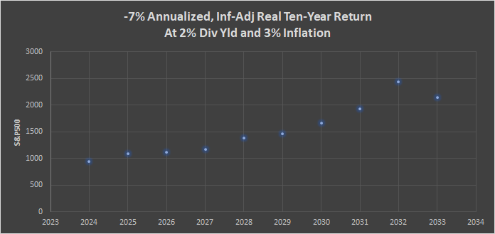
This is given a 2% dividend yield (currently it is 1.57%) and a 3% YoY full CPI (currently it is 3.23%). These are reasonable assumptions, even though the end-result, the value we might see the S&P index at in order for the+12 to - 7% pattern to continue, is most sobering.
On the other hand, if we are wrong, if conditions do, in fact, turn an we re-visit a+12% average ten-year average real total return, with the same assumptions for dividends and inflation, here is what we would be looking at for the S&P in the coming years for that 12% to manifest by any given year:
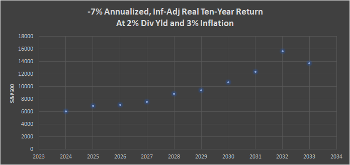
Those are some very different values indeed on the vertical axis on the left!
So why do we believe we are headed towards the -7% most likely at this time? The rest of this discussion will sketch this out, but it is not to imply that the facets to be discussed in the balance of this report are not subject to change. Rather, we monitor the data as it comes in, and if things do, in fact, change, we too will amend the forecast as required.
The second over-arching, long-term factor we look at is the Percentage of Household Assets Invested in Equities.
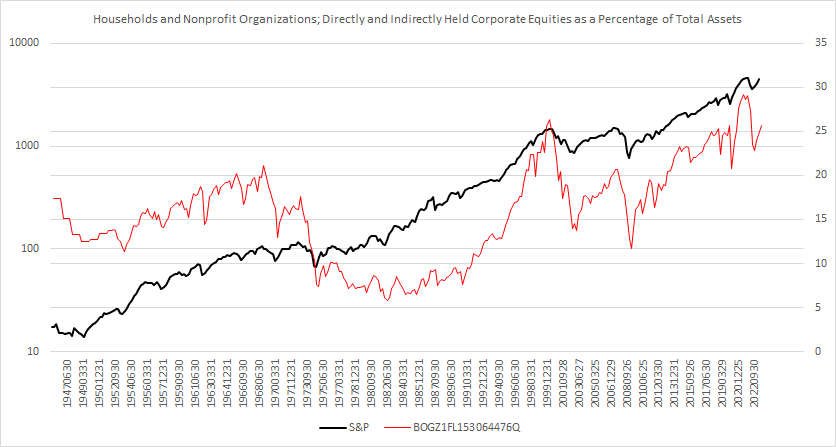
If we examine the relationship between this percentage and subsequent ten-year average returns:

The data ends with the third quarter of 2013, to be able to post the average annual return of the following ten years. Notice that readings beyond 23% of household net worth in equities have never been followed by a subsequent ten-year average positive return.
Here is the chart with the 29.23% seen in June 2021, a condition that perished until the fourth quarter of 2021. Presently, we are at 25.63%
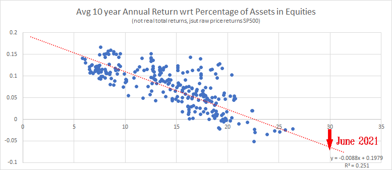
Recall, historically, beyond 23% there has never been a ten-year subsequent period of positive returns.
Hence, the reason I believe the ten-year rolling real total return is headed to -7% before +12%.
However, if we examine the Six Major Pillars that Support Equities Prices, we find further evidence, and it is these six major pillars, if they would become positive, in the aggregate, we would have to re-assess these two big, overarching factors. But as you will see, that is not (yet) the case.
1 Sentiment
This pillar only matters at extremes, and we measure it in numerous different ways, from the various surveys of investor sentiment, to the VIX futures backwardation structure. None of these measures are at extreme readings here.
However, it is important to note here that longer-term measures of sentiment, such as was just mentioned regarding the percentage of household net worth in equities, are coming off extremely “overbought” areas. The speculative fever, rekindled after Covid and fanned to a feverish conflagration which witnessed “stonks,” as well as the huge run in both price and issues for crypto (and the train-wreck seen in NFTs) are all symptomatic of extreme speculative exuberance, and late-stage speculative market characteristics which we have seen over-and-over again (from the founding of listed options amidst the 1973 market, for example). The point is, we are headed on the downside of what was a massive speculative bubble which, I believe, still offers support to speculative prices despite the competition of actual interest-bearing vehicles once again.
2 Valuations
Although earnings are increasing, valuation models are stuck in negative as the return of short-term rates has a strong dampening effect on such.
3 Economic
Some economic numbers are very positive, not only the growth in GDP, but some of our models (e.g. Art Vanedelay) have since turned positive (not all, other major ones like those using Industrial Production are still quite negative). One that bears a lot of weight, Leading Economic Indicators, is positive as well now.
The Economic Indicator pillar is very mixed now, as we might expect. Post-covid, much of the numbers are naturally confusing. Supply Chain issues, and the “fish-tailing” we spoke of when this started, are playing out and causing what will likely be some long-standing issues as a result (e.g. the current trucking crisis) Some sectors are doing well (IT, particularly those involved in AI) while others are dire (Hospitality, Commercial Real Estate). WHeres the natural cycles that existed in industries and business has seen a bad perturbation, the peaks and troughs of most industries running together, is now not the case - and the result is this “messy” economic Indicators Pillar.
To further obfuscate tings, seasonal-adjustment, post the Covid Lockdowns, are borked and likely will remain so for years to come.
The Economic Indicators picture is difficult to see clearly, as it is muddied at best here.
The general trend, however, is still negative, as shown graphically in the 52 week average of continuing claims to the Goldman Commodity Index.

The consumer is, in-fact, tapped-out at the moment, and the restarting of Student Loan debt repayment is increasing real disposable income for the consumer.
4 Technicals
This is a big one right now.
For starters, the notion of a “double top,” and the ramifications of that. If, in fact, this is a such a formation price is building here, then the minimum downside projection would be at about the Covid lows of March and April 2020, or around just under 20,000 Dow Jones Industrials or just under 3,500 on the S&P500.

This is a minimum projection for this type of pattern. But how do we know this is not the early stages of a new, post-Covid bull run? That we aren’t in a new “Roaring Twenties” type of market?
First, I would add I am not averse to that type of market. In fact, I would hope, for all of our sake, that would be how things eventually turn out. However, that is not what we are seeing in the numbers at the moment. However, that is not to say that things cannot turn here, and if they do, we will as well.
But the technicals are telling us a dire, longer-term picture, As mentioned in recent weeks, the weekly advance-decline line has broken down below its October 2022 bottom lows. This is a bad harbinger for stocks.
If we look at daily New Lows, they are telling us a lot about what is going on underneath the surface and what to expect in the next couple of months.