

Rates and the Market
Rates and the Market
The next move in rates is DOWN, and that has not historically been bullish

The following chart depicts the discount rate since 1980, along with the S&P. And as you can readily see, falling rates have not necessarily, historically, corresponded with rising stock prices, but rather the opposite this century:

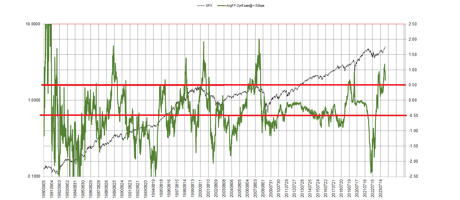
Beneath the discount rate chart, we see the chart of the difference between weekly average Fed Funds and the 2 year T-Note. I cannot tell you what goes into the Fed’s rates decision-making process, but I can clearly demonstrate, as above, that it is the shape of the short-end of the yield curve that corresponds to their decision, every time. When this difference gets above 50 bps, cuts are imminent, and vice versa. The timing is seemingly capricious, the direction is not.
Hence, whatever is being said here by the Fed, with history as our guide, we can be relatively certain the next series of moves by the Fed will be for lower rates (although we cannot rule out another hike before this sequence gets started, given the capricious and generally late, nature of the timing).
And their aggressive posture is mirrored in the balance sheet run-off, depicted below, which is not consistent with lower rates.
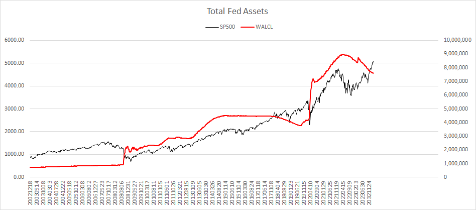
And in terms of reported weekly differences, this past week was one of the more aggressive in terms of tun off of MBSs and junk:

Finally, in looking at our model for predicting the 90-day T-Bill, using inputs of only the unemployment rate and inflation, we see what looks like a coming convergence here once again, a convergence that would be hastened with another rate hike affecting the blue line:

I don’t need to reiterate that by all valuation measures, we’re at historical levels (some, like market-to-book, exceeding the highs of 2021-22). I don’t need to reiterate that since the October 2022 bottom, Industrial Production and Capacity Utilization are at lower levels no than then (and yet, seemingly paradoxically, personal income net of transfer receipts, continues to climb).
Several weeks ago, we were examining the relationship of 90-day T-Bill rates vis-à-vis EPS in the S&P 500. Looking at month-end data since 1934:
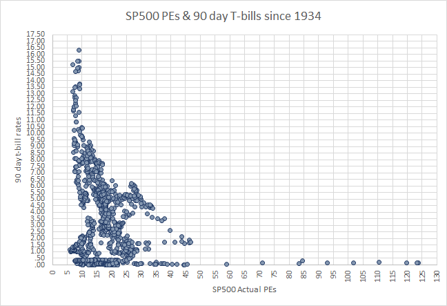
At roughly 5 1/4% T-bill rate, an S&P EPS of 27.62, and the S&P itself at 5088.80, we can peer out over the 90-year history and see that the highest the S&P ever traded at this EPS with these competing rates would correspond to a value of S&P 5480 today.
If rates were to approach 6% it’s an extreme S&P reading of 5037. And as the graph bears out, at ever-higher rates, EPS multiples have had a more domineering effect on price.
Yet, we’re clearly in an all-time speculative bubble, not just given the thinness of breadth, the meme stocks of recent years, the plethora of things to speculate and “gamble” upon (e.g. legalized sports betting in many locales now), the momentum of this impedes our timing. This is an era of “mistiming” in this regard that I have found demoralizing, perplexing, and calls for specific tools in timing.
From these current stock price levels, to return to an average annual ten-year rolling real total return (A10RTR), with 2% dividend yield (it is currently 1.44%) and 3% inflation (it is currently 3.11%) to experience what would register as a -7% A10RTR would mean a drop of more than 70% in the big indexes from here, even over the next 4 years!

Do you want to be reliant on the Fed to provide you downside protection to this?
On the contrary, the best timing tool I’m aware of for this situation is what I call the “Bloodbath Indicator.”